
Faux Nostalgia 2:
HeartZone
Photo-Manipulation, Self-Portraiture, and ’80s LP Layout Design Homage
In a then effort to update my Facebook profile photo, I happened to take a really crap-quality cellphone picture of myself (it was 2011, taken with an original Motorola Razr V3; we did not have the megapixels yet), and then subsequently edited it into something that somehow turned out to be okay—and even more-so, felt vaguely reminiscent of black and white/sepia-tone album covers from any number of solo musicians in the mid-to-late-'80s:

The potato-quality-cell-phone-selfie-to-serviceable-monotone-portrait pipeline.


Case studies: monotone, contrast-y, moodily-lit ’80s album art portraiture goodness.
Anyway, I made the offhand comment about the "'80s album cover" similarity after uploading the edited picture to Facebook, and eventually ended up deciding to go ahead and just complete the process:

This was essentially done with much of the same techniques I used in creating the Mystery Solvers Club project, including getting the printed quality just right, beating 20+ years of age into it, and matching not only the slight perspective of the LP in the photo I found online that was used as framing (see below), but also the camera quality to boot.
The logo was the first thing to come. Initially, I actually had my name in the hand-lettered style, with the album title set in type. After a switching of those elements, and placement of a "wouldn't be complete without it" stereotypical '80s polygon and neon color scheme, the logo was ready:

Every time I see this title, some combination of Loggins' "Heartlight" and "Danger Zone" starts up in my head.
Finding a good enough image of an aged-looking LP record still in its wrapping was pain enough…

…but then hunting down the proper stickers turned out to be an even bigger task.
For example, as popular as I swear the iconic "Nice Price" stickers were, the only high enough quality image I could seem to find of it—if any at all—was this one:

It actually took me a few days, and three different iterations to get it to the point you see in the final HeartZone LP image. I'm pretty sure the only thing which still remains that I didn't have to recreate from scratch on that damned sticker is the typography itself, warped from the above image into a straighter alignment:
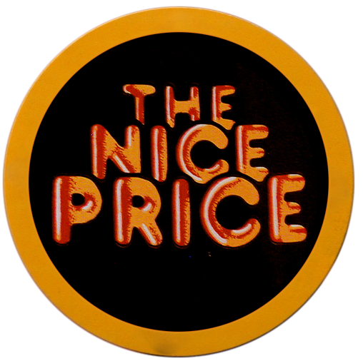
Digitally reconstructed facsimile of the classic "The Nice Price" sticker.
But I digress.
Opposite this, digitally creating the "singles" sticker was actually pretty fun, and is as much a nod to actual songs of the '80s as the album title itself!:

Bonus points if you know which actual songs those titles are referencing.
In all, it was another fun project to keep my Photoshop skills fresh.
To play us out, here's a version of the photo with the original,"un-washed-out by photo-manipulation" design that you'd find on, I dunno, Spotify I guess:


